Adobe Creative Cloud 2014 Splash Screens
NOTE: On October 6, 2014, Adobe updated the splash screens again. I personally will miss the lion on the Illustrator splash screen, but I think many users will find the updates to be a welcome change.
For better or for worse, Adobe just released a major update to the Creative Cloud suite of applications. The jury is still out on whether the update is an improvement or a nuisance, but for the time being, we have some new splash screens to enjoy upon launching the updated apps.

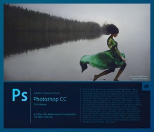
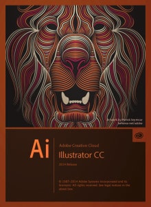
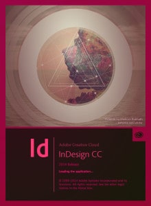
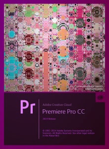
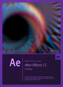
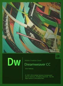
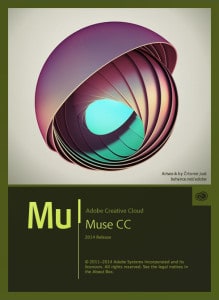
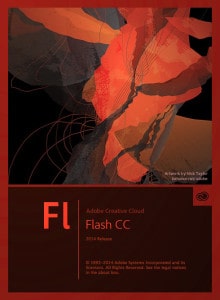
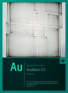
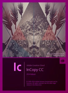
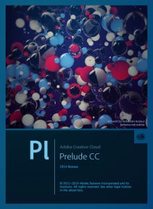
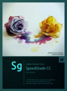





 Photo by Samuel Branch on Unsplash
I actually love these new ones (not that I hated the older ones)! Its a bit different than usual though as this time they are including some art work by the people, these really have a nice change to them. Still love the extra large splash for Photoshop as in the older versions. I just don’t like the artwork in the Muse Splash Screen, isn’t that organic…..
For those who don’t like them there are good news. No, I don’t know how to disable them. Expect new ones for the next update. I’ve provided 2 art pieces for Premiere Pro and Audition and I have already seen the rest and they look good to me.
Everything looks really good except After effects. It´s awful. I hate this one. Even i´m gonna keep using the previous version until Adobe change this horrible bluury pixelated and ugly low res image.
You can edit the screen if if bugs you too much. (Google it) Or just don’t look at it when you launch the program. You only launch it once a day right? 🙂
As a Pre-press dood I’ve used the Trinity sofar. I like the splash screens. In Photoshop I barely get a good look at it before it disappears (I have a Late 2013 MacBook Pro Retina with a SSD). I love the “Single Malt Whisky Cat” Easter Egg (option-command-about Photoshop).
I had no idea about the Single Malt Whiskey Cat…too funny! Thanks for sharing, Ted.
I still think my favourite ones so far were on CS6.
i want to disable it.
Photoshop CC 2014 Splash Screen . . . man, I’ve developed a massive aversion to this . . . hate it when the app loads . . . wish I could mask it somehow . . .
Hate ‘em all. Especially the Photoshop one … It gives me the creeps. So ugly.
I would prefer minimalistic slash screen … Or at least changing picture each time we load the program .. connected to Behance
it was nice or neutral at first (depending on the artwork) then it become annoying and now it’s driving me crazy especially ps one, thankfully it’s only few seconds…
Ugly – creepy.
they all remind me of math text book covers lol
I hate the PS splash screen…..her feet are cut off at the bottom of the frame!!!! OK, it may be an anal photographer’s twitch, but please, I have to stop looking at it when it loads.
You gotta do what you gotta do, Brad. I think one of the commenters above mentioned there is a way to disable the splash screen. Can anyone concur or provide a link?
My aversion is growing for the new PS splash. Please someone help us customize these suckers. Adobe, you are selling to creative people! Let us enjoy using your product with our own art attached. Please?
the Photoshop start-up image is awful. Its the flagship program, and that’s the best we get. I could seriously work up the design in 5-10 mins.
I agree with what Bryan Welborn says! I’m a creative. Show me something to get me inspired. Not 2 images pasted together!
Hey everybody, new splash screens! If you have seen any of them, let us know whether you are relieved or once again frustrated. I’ll post the new screens soon.
Not only I’ve seen but I made the ones for Premiere Pro and Audition. As you can expect I can’t have bad criticism towards my own work but hey, check them out on my behance and tell me if they’re worth being featured.
My portfolio: Be.net/alextc1
The pieces are “Listen” for Audition and “Dream” for Premiere.
Check them out.
Hey guys, just be cool about it. Just change the splash into something else. Just what I did to all ‘splashes’ in all my CC apps.
Problem solved.
Hate meter: 0%
I have looked everywhere and can not figure out how to change the AE splash art. How do you change it?
how do they pick such uglie splash screens? dreamweaver and ps cause eye cancer.
Some definitely agree with you, Christian! Especially the 2014 images. What do you think about the 2015 splash screens?
https://ajdesignco.com/2015/06/adobe-creative-cloud-2015-splash-screens