The Renaissance, Abbeville Chamber's Business of the Year

The Renaissance: Abbeville Chamber’s Business of the Year!

The Renaissance, Abbeville Chamber's Business of the Year

The Renaissance, LLC staff members Sheryl Fleming, Paul Bell, Susan Jackson and Jacqueline Owens received the Business of the Year award from the Abbeville Chamber of Commerce annual banquet on May 12, 2017.

ChooseRenaissance.com Screenshot - May 12, 2017

Click to visit ChooseRenaissance.com.

The Renaissance is an active lifestyle retirement community located in Due West, South Carolina. AJ Design worked with The Renaissance toward the end of 2016 and in early 2017 to provide a completely redesigned and expanded website.

On May 11, 2017, The Renaissance was named “Business of the Year” at The Greater Abbeville Chamber of Commerce Annual Banquet. This honor is well deserved from my perspective! The staff at The Renaissance are doing a phenomenal job caring for residents and creating a genuine community.

Congratulations to The Renaissance for being recognized as Business of the Year by The Greater Abbeville Chamber of Commerce!

AJ Design is Now Accepting Stripe for Online Payments

AJ Design is Now Accepting Stripe for Online Payments

This week I set up Stripe as a payment processing option for AJ Design. I am content to receive checks for payment of services, but that’s a major inconvenience for some clients. I am glad to be able to offer a convenient online payment option, even though there will be an adjustment made to cover the merchant fees.

How about you? Do you pass merchant fees through to your clients/customers? Or do you adjust your pricing to conceal the fee?

Here’s a hint: The customer ALWAYS pays…they just don’t always realize it!

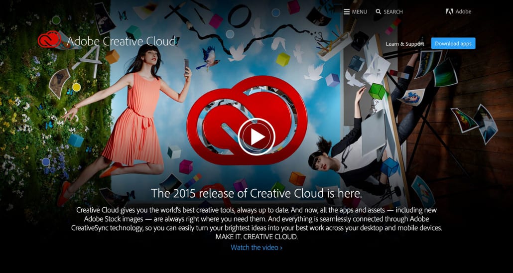
Update All: Adobe Releases Major Update to Creative Cloud for 2015

Adobe just released a major update of Creative Cloud. I’m updating now, and I hope there are great things to blog about later. Looking forward to it!

creative-cloud-2015

The New 12″ MacBook is Just a Toy

I didn’t carve out time to watch the product announcement video about Apple’s new 12″ MacBook. I completely missed it. But I saw the articles and videos about the new MacBook trending the day after. As an Apple user (and occasional Apple fan), I was intrigued by the impossibly slim 12″ MacBook released last week.

What’s not to like? Sleek, color coordinated with my iPhone, well built … wait, where’s the USB port? Or the SD card slot? Surely they at least have a Lightning port, right? Nope. There are only two ports on the beautiful little body: a headphone port and a USB-C port.

I’m charmed by the promise of USB-C, really I am. But to have a computer that can’t be connected to power and connected to storage or an external display at the same time without extra adapters or ports is just unconscionable for Apple to pass off as “Pro”.

But let’s look again. The new little hot rod 12″ glamour notebook we saw is not Apple’s idea of a “Pro” tool. In fact, Apple removed the “Pro” moniker for a couple of good and purely hypothetical reasons:

  1. They know the new MacBook is less of a pro tool and more of a toy.
  2. Apple hasn’t abandoned those of us who really are pro users of their top-shelf hardware. They just haven’t updated the 15″ MacBook Pro yet because they can’t get the Broadwell chips from Intel until later this year.

There you have it, folks. I would advise against buying the new MacBook if you are a pro user (if you earn your living in the creative arts and currently use a slightly older Mac Pro or MacBook Pro).

Let toys do their thing for the people who love them.

But the real pro users should opt for the updated MacBook Pro 13″ or wait for the revised 15″ MacBook, rumored for release sometime this fall.

Adobe Creative Cloud Mobile Splash Screen

Adobe Creative Cloud 2014 Splash Screens

NOTE: On October 6, 2014, Adobe updated the splash screens again. I personally will miss the lion on the Illustrator splash screen, but I think many users will find the updates to be a welcome change.


For better or for worse, Adobe just released a major update to the Creative Cloud suite of applications. The jury is still out on whether the update is an improvement or a nuisance, but for the time being, we have some new splash screens to enjoy upon launching the updated apps.

Love ’em? Hate ’em? Comment below!

Photoshop CC 2014 Splash Screen

Photoshop CC 2014 Splash Screen


 Illustrator CC 2014 Splash Screen

Adobe Illustrator CC 2014 Splash Screen


InDesign CC 2014 Splash Screen

Adobe InDesign CC 2014 Splash Screen


 Premiere Pro CC 2014 Splash Screen

Adobe Premiere Pro CC 2014


After Effects CC 2014 Splash Screen

Adobe After Effects CC 2014 Splash Screen


Dreamweaver CC 2014 Splash Screen

Adobe Dreamweaver CC 2014 Splash Screen


Muse CC 2014 Splash Screen

Adobe Muse CC 2014 Splash Screen


Flash CC 2014 Splash Screen

Adobe Flash CC 2014 Splash Screen


Audition CC 2014 Splash Screen

Adobe Audition CC 2014 Splash Screen


InCopy CC 2014 Splash Screen

Adobe InCopy CC 2014 Splash Screen


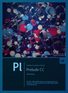
Prelude CC 2014 Splash Screen

Adobe Prelude CC 2014 Splash Screen


SpeedGrade CC 2014 Splash Screen

Adobe SpeedGrade CC 2014

Is PicMonkey a Tool or a Toy?

A friend of mine aspires to launch a photography business. She has been learning composition and lighting from an established photographer. She has already done some portraits, and she had been booked for a wedding. We were “talking shop” about cameras, lenses, and editing. She mentioned she uses PicMonkey for editing. I wasn’t familiar with PicMonkey initially, but my first instinct was that a pro-oriented tool like Photoshop would be a better choice for a professional result. That is just my default recommendation based on the axiom that you usually get what you pay for. However, I knew I was ignorant of PicMonkey.

I’m not a fan of ignorance, and I don’t want to rest on my own assumptions, especially if my assumptions would lead me to pay for Photoshop if it were not uniquely necessary and powerful. I started Googling to find out more. The initial results I found were quite warm toward PicMonkey, but they seemed a little suspicious to me. I came across articles with titles like these:

PicMonkey: Photoshop for Broke People

Making Professional Looking Pictures Using PicMonkey

Don’t Want to Learn Photoshop? Use PicMonkey Instead!

Those aren’t the actual article titles I found, but you get the idea. The sentiment from those articles was that photographers and designers who want to save a buck can use PicMonkey and avoid purchasing Photoshop. I didn’t dig too far, but I didn’t find anything overly critical of PicMonkey. My “too good to be true” alarm started going off. I wanted to explore both sides of the issue, so I posted questions on social media to get some feedback from friends. Much to my surprise, the official Twitter account for PicMonkey (@PicMonkeyApp) actually replied. Here is the conversation, unedited, for your edification:


Here is PicMonkey’s response:

Well, that wasn’t too much help since I hadn’t yet used PicMonkey. Since I had the ear of PicMonkey on Twitter, I started checking out PicMonkey and found a few other questions worth asking:


I haven’t received answers yet from PicMonkey, and it has only been about an hour. But based on my initial findings, here is my conclusion:

Let me make something clear by rehashing a point from an earlier tweet: I am not trashing PicMonkey. For certain things, it is fantastic! If you need a lightweight, cloud-accessible solution for editing images for a blog or social media, PicMonkey is wonderful. For crying out loud, you can’t even install Photoshop on a Chromebook! If you are preparing images for standard definition or even full HD (1920×1080) displays, PicMonkey will work well. If you just want to make fun edits to images to print out at home and slap on your refrigerator, go ahead and use PicMonkey.

But if you are a professional photographer or designer and your work will be printed larger than 9 inches at the largest dimension, you shouldn’t even consider PicMonkey. For professional results, use professional tools.

Password Security Is NOT Optional

If you own a website, there is a good chance someone is trying to hack it right now. Forget a website … if you simply own a computer that is connected to the Internet, you are probably being targeted. Is this some kind of conspiracy-theory-driven fear tactic designed to sell security software? No. Sadly, this is pure anecdotal evidence from the last 30 minutes or so.

One of my websites is powered by WordPress. To beef up security, I use a plugin called Wordfence. I got an email alert from Wordfence that my actual administrative username had been locked after 20 failed login attempts. Of course, I hadn’t tried to log in at all today, so I knew it was a potential attack. Sure enough, I was locked out of the site. But the site was secure. The hacker tried to get in but was met with a strong password (thank you, LastPass).

Wordfence has an intriguing feature called Live Traffic that allows you to see the IP addresses of any users or search bots that have recently accessed the site. I was curious to see the attempted login activity and was shocked to see that there were multiple login attempts from nonexistent admin-sounding usernames. I checked another site I manage and found a similar thing there.

I’m not scared, and neither should you be. But one reason I’m not scared is that my passwords look sorta like this:

j&4%”kshgHfgoO0wbh&$#Ondu6%$3h

And yours should too.

Learn the security options available to you for your website and/or your computer. Stay smart and prevent hackers from even attempting to access anything. But if all that fails and a hacker is knocking on the door, make sure you have a strong password. Use a service like LastPass.

If you use good security practices, you don’t have to worry about global, distributed brute-force attacks like this.

Do you run Quickbooks and an online store? Meet your new best friend: Webgility


Several of my clients have e-commerce capability planned for their websites. While it is much easier to do business on the web than ever before, it’s still not for the faint of heart. Customers have options. Millions of them. And if your front-end or back-end isn’t ready for prime time, you had better not even go live. What happens when someone picks up an item and brings it to the register at the same time as a customer on your site clicks “Buy” and confirms their order? Problem.

Enter Webgility and their eCommerce Connector. In short, the eCC synchronizes Quickbooks activity with the activity on your website. Once eCC is in place and properly configured, sales that occur at the point of sale will automatically deduct inventory quantities from your website. And online customers will be added to your Quickbooks customer list. No more manual data entry, oversells, or backorders. This will save time, money, sanity, your marriage, your reputation, etc. You get the idea. Making beautiful websites isn’t easy. But making beautiful websites that integrate with Quickbooks? That’s business-friendly graphic design.

I’m excited about deploying Webgility solutions on a couple of websites that are in my development queue right now. Expect to read future blog posts once we go live. And certainly, contact me if you want to discuss a new project. But if you would like to get started with Webgility’s eCommerce Connector on your own, feel free to click here to learn more and save $20.

Problems with Comments

Hi everyone,

All two of my loyal readers (including you, Mom) may not really care, but I have recently been made aware that some users are experiencing problem when attempting to post comments on my site. I had wondered why it was so quiet in here! So where does the guy who helps people build websites go to get a befuddling problem with his own website fixed? To another more specialized web developer, of course. We’ll get it sorted out soon.

In lieu of comments in the actual posts, if you want to participate in the conversation, go over to Facebook page or my Contact page.

Hopefully, this will become more of a two-way street soon.

Best regards,

Andy

Clean slate.

I needed to make some updates to my website. Long story short, I had to reinstall WordPress and start from scratch. No pages, no posts, no plugins. Just a vanilla site, complete with a Hello Dolly quote.

How liberating! The blank canvas is stark, but it holds limitless possibilities.

Liberating as it was, I really needed to restore my blog posts for SEO purposes. My good friend Jay Hughes of Ingage, LLC was able to help me restore my posts from a SQL backup I made before all the chaos began.

The saga that is the blog of AJ Design continues.