Posts
Bad Design Done Better: Use Fonts Correctly
/1 Comment/in Bad Design Done Better/by AJ DesignA New Sign for a New Neighborhood
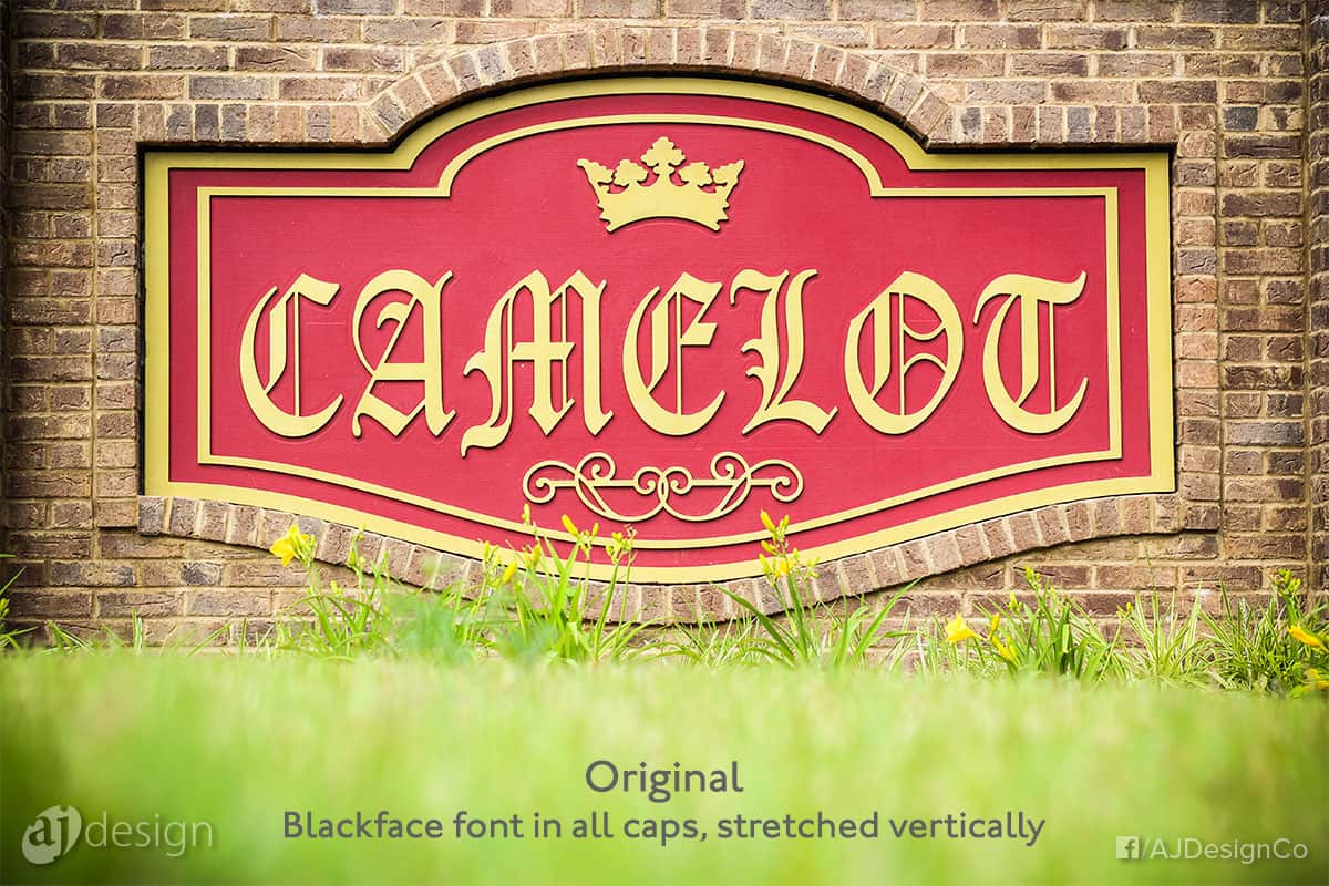
There is a newly developed neighborhood not too far from my home. (Note that we don’t have gated communities in Abbeville, SC; this is just a regular ol’ neighborhood — with no gate.) I was somewhat excited when I saw construction begin on the stately entrance and the sign. “This is going to be nice,” I thought. I was in for a rude awakening when the name was applied to the sign:
I was underwhelmed, to put it mildly. The crown and the flourish typesorts were very good. The colors are fantastic and conceptually appropriate. But the typeface choice of ALL CAPS blackletter? I was dismayed.
About Blackletter Type
Blackletter typefaces were built to mimic hand-drawn manuscript lettering from the era when Gutenberg developed the printing press. Blackletter fonts are widely available on many computer systems and have been for years. A common blackletter font option for Windows users is Old English.
You may not be able to put your finger on why this typeface is not the best choice. In fact, the type family itself isn’t bad. But blackletter fonts are incredibly hard to read when presented in all caps. It’s just not done, and this CAMELOT sign presents one supporting example of that fact. Another detail that will grate typography purists is that the characters were stretched vertically.
Better Ways to “Dress” Camelot
First of all, it is completely understandable that the developer wanted to evoke the nobility and romance of Camelot. The name choice is admirable, even if it is just a neighborhood and not a proper gated community. But in my opinion, the sign artist could have done a couple of things differently to yield a much better result.
1. Use All Caps Without Distorting the Characters
It seems the sign maker and the type designer may not have been on the same page. The aspect ratio of the sign was set. And the name layout appears to have been done independently of the aspect ratio. Also, the person ordering or designing the sign must have been afraid of clear space. Simply adding “CAMELOT” in all caps would result in a name that was wide and left a lot of empty space above and below. I’m still not sure that’s a bad thing, but the designer or signmaker solved this “problem” by stretching the characters so the word had a taller aspect ratio that better filled the space.
Type developers, whether from decades ago or in more recent times, devote hundreds of hours to crafting typefaces with the right proportions, shapes, kerning, tracking, weight, etc. If you think it is easy to design a typeface, you are mistaken. There are graphic designers and artists, and then there are type developers. I’m convinced type developers are a different breed altogether.
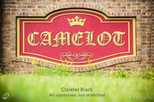
Rather than thinking, “I know better. Let me just stretch this to fit my space,” a wiser decision would be to simply use the characters as presented in the font without distorting them. If the decision maker was adamant about a blackface font in all caps, the best way to display that would have been to place the characters centered in the space without distorting them:
2. Use Title Case for Blackletter Type
Jacob Cass of JUST™ Creative produced a brilliant type classification ebook which he generously offers for free on his site. On page 17, Cass explains a nuance of handling Blackletter type:
Text type faces should fit snugly together with less space between the words than is customary with normal Roman types and, because of their complex structure, [blackletter type] should never be set in all-capital form.
*emphasis mine
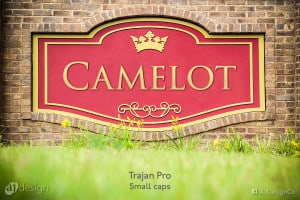
If the CAMELOT sign designer had come across this ebook and had better instruction on handling blackletter type, he might have made a sign that looked something like this:
 3. Consider Small Caps
If the goal was a majestic look that evoked the era of Camelot, then Trajan might have been a nice choice. This distinguished font is often used on movie posters (over-used if you ask some folks). But in this context, I think Trajan might be appropriate. What do you think?
They might even have considered another serif font like Garamond. This example is set in small caps, and the tracking is expanded to 120:
Conclusion
The CAMELOT sign is a lovely concept with beautiful colors, and I hope the housing development does well. But I can bet you that if there are any graphic designers or type developers who make their home there and have to drive by that sign every day, they will probably cringe a little until they stop noticing it.
Latest Posts
 So, how are things in your world after 2020?October 4, 2021 - 1:38 pm
 Continuous Improvement: Not an OptionAugust 31, 2018 - 8:55 am
 Why Photographers Shoot Way More Than They NeedJuly 12, 2017 - 8:27 am
 In Honor of Bad FathersJune 18, 2017 - 8:51 am
 Price vs. ValueJune 15, 2017 - 10:14 am

