Turn “Tire Kickers” into Customers – Tune Your Landing Pages

One of the interesting paradoxes about what I do is that after I spend my professional expertise developing creative and engaging content for clients’ ads or marketing collateral, I have little or no time remaining to do the same thing for my own business. Such is life, right? The cobbler’s children have no shoes.

I may have a hard time doing a few critical things for my own marketing efforts, but it doesn’t mean I don’t know what to do. (Yes, that even sounds like a cop out to me as I type it…)

Here is a link to a great infographic from our friends at HubSpot via their Unbounce landing page testing utility. Read it with me, and make improvements to your own landing pages when you have the time. I know I will!

http://blog.hubspot.com/blog/tabid/6307/bid/33453/10-Stops-to-Take-on-the-Road-to-Lead-Generating-Landing-Pages-INFOGRAPHIC.aspx

And if you want to contribute to my overgrown workload and further prevent me from having time to actually implement these principles myself, call me at (864) 554-5061 or Contact Me to discuss your project. I know I need to do a better job marketing my services, but I’ll be glad to be the “cobbler” with barefoot kids so you can have a better marketing function.

Illustrator Template: Desktop Wallpaper for Typical Monitor Sizes

multiple-monitor-desktop-wallpaper-image

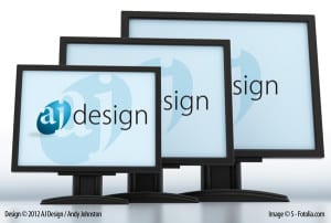
Have you ever needed to design desktop wallpaper that was consistent across several sizes? Here is an Illustrator file that will allow you to create desktop wallpapers for the following resolutions:

Artboard 1 – 1024 x 768
Artboard 2 – 1280 x 720
Artboard 3 – 1280 x 960
Artboard 4 – 1366 x 768
Artboard 5 – 1600 x 900

To use this template, align your art to the center of Artboard 1. Make sure it fits within 1024 x 768 and has sufficient margin. Create or place a background that is as larger than each of the artboards. When the design is finished, select the artboard with the size you want and then go to File > Save for Web & Devices. Select your format and your export options. Click Save and choose a filename. Repeat for the other sizes you need.

Terms of Use:

This template is royalty free, and can be used in any of your projects, both personal and commercial with no attribution required. Please do not host this template elsewhere or redistribute it in itsoriginal format. If you found this helpful and would like to share it with others, please direct them back to this page.

Branding as a Security Mechanism for Your Customers

padlock-secure-brandingA GwdToday.com article outlined a recent rash of “smishing” threats in which people reported receiving fraudulent text messages indicating they had won gift cards from Best Buy or WalMart. The article cites Best Buy’s website as the source of this quote:

“Don’t respond to e-mails, text messages or online ads offering free gift cards. Make sure the website address and branding match up with the company referenced in the offer.”

How about your business and your brand? Would you be able to tell customers to steer clear of messages that don’t carry your brand? Could the average consumer tell the difference between official communications from your business and a cheap knockoff?

Branding – and all of the sub elements of branding like logo design, advertising, etc. – is a strong tool for the sales function of any business. That is understood without much explanation. But Best Buy’s tip on their website hints that branding is a tool for security. In an age where identity theft is becoming increasingly commonplace, it is no longer optional for businesses to have strong security practices. The next time you are considering your security vulnerabilities, consider these best practices of branding as tools to enhance your customers’ confidence in your business.

Consistency and Precision

There is a difference between ACME Widgets, Inc., Acme Widgets, Inc., and Acme widgets. People who resort to phishing (or “smishing”) tactics usually don’t attend to the details like capitalization or punctuation. Many logo designers prepare graphical  standards to ensure the logo is properly reproduced in a variety of contexts. In addition to visual standards, your branding standards should also encompass text-based presentations of your company name and other identifiers like  your web address, product names, and slogans. Make sure your name is presented the same way every time. This uniformity helps differentiate the genuine from the false.

Uniqueness

Anyone can buy a piece of clip art, drop that in Microsoft Word, and add text under it. Some graphic designers with professional quality software tools even resort to cookie-cutter art. But when you take the time to craft a unique logo to support your brand, you are telling the world, “I am here, and there is no one else quite like me.” You are also making it harder for would-be thieves to mimic your brand and take advantage of your customers.

Clarity

Brand clarity is closely related to consistency and precision. Is it easy or hard to discern your message? What is the purpose of a particular email or document? The more obvious the answer to those questions, the better. Make sure communications stay on point. Use clear subject lines for service-related emails. Don’t make a customer guess at the message you intend to convey.

It’s your turn now. What are your thoughts? Have you seen any great examples where branding has strengthened security or prevented fraud? What about really poor examples? Comment and post links below. Feel free to change names to protect the guilty if you must!

A Glimpse of the Abbeville Spring Festival

Ride Night at the Abbeville Spring Festival © 2012 Andy JohnstonWe were at the Abbeville Spring Festival this evening. I had my Fuji S-9100 on hand and decided to try and capture some of the fun. I have been sort of chained to my desk for the majority of this week working on a couple of urgent projects for clients. This image is a good reminder to me that it is worth it to unplug from the work.

FYI, this image is unedited. It was sort of a “lucky shot” in low light without a tripod.

Enjoy!

Andy Johnston

Mobile Marketing: Something Worth Doing Well

Today Hubspot offered a great post about mobile marketing. I have to admit that I’m not a mobile-crazy, app-developing, mobile expert (except that I’m a fairly adroit user of an Android OS phone). But I am aware of how mobile consumption of the web is trending, and I’m aware of how that trend is shaping design and the entire marketing function. For those of you who are jumping into the mobile world to promote your business, Hubspot’s infographic presents 17 factors you should consider before, during, and after your efforts.

In the wild world of business, sometimes you just have to shoot a few times then start aiming. This is especially true for start-up companies. But I highly recommend you at least consider these 17 suggestions and ask yourself, “Do we have a plan for that?” If you do, great. If not, make sure your business goal justifies the risk of ignoring these sensible and helpful principles.

The 17 R's of Savvy Mobile Marketing [INFOGRAPHIC]

Note about my relationship with Hubspot: I am not employed, in contract, or in any other way compensated by Hubspot. But I was certified as a Hubspot Inbound Marketing Specialist when I worked for Lee Resources International, Inc.

Before & After Magazine: A quick mention of a great design resource

I don’t plan to give away all of my secrets.* But I wanted to pass this along:

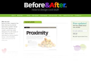
Before and After website

Before & After is a resource devoted to helping improve design. I find the articles enjoyable and helpful, and I know clients who appreciate my work will occasionally appreciate resources like this. There are a variety of free resources in addition to their paid service.

* Of course I won’t give my secrets away, but I’ll gladly use them in the process of serving my clients.

Why Your Logo Matters

books-on-a-shelf-bwDo you remember in grade school how your parents and teachers would try to keep you from being judgmental and cliquish? The most memorable phrase was, “Never judge a book by its cover.” And I’m revealing that I am a child of the 1980’s, but who could forget the second phrase of the Transformers theme song: “More than meets the eye…” We were raised around attempts to help us look past appearances and make a more discerning appraisal of the people and situations around us.
Fast forward to present day. You are running a business. You don’t have any big corporate office that tells you what to do. You are completely independent. Right around the time you got started in business, your first few customers or clients sort of found you. The thrill you got from meeting their needs helped propel you to launch your own business. Then you realized that in order for your business to survive, you will have to begin reaching out and communicating to others about what you do. You need to network. You need to market yourself. How do you do that without a business card? So you head down to OfficeMax and put together a business card. You select an image from their nice clip art library and put it there beside your business name, along with your phone number and email address. Now you’re ready to network. You’re ready to step out there and…be judged.

Logo design is important because it is the main element through which you make a first impression. Your logo (whether it is on a business card, your website, your vehicle, or your estimate form) sets the tone for what your customers can expect from you. Your logo tells who you are, and it also reveals a little bit about your future aspirations.

Let’s take a moment to make a critical distinction. In the mind of many business owners, logo design and branding are synonyms. They are related, but they are far from interchangeable. A logo is a unique representation of a business, service, or idea. Logos often incorporate stylized text or graphical elements, and they may include one or many colors. A brand is what a person thinks concerning your business or organization. It is the sum of the first impression and every subsequent impression that a person experiences about your business or organization.

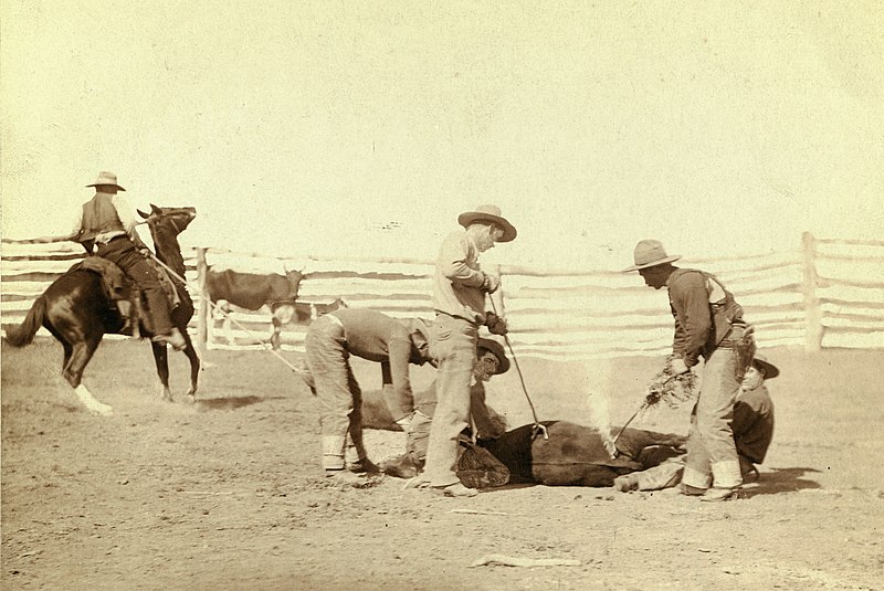
In short, your brand is the mark you leave:

Cattle Branding

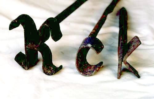
Your logo is one of the tools at your disposal to create a brand:

Branding_irons-Dutch_K,_c,_and_k

There are many ways to reinforce a brand over time. Every interaction your have with your customers or clients is an opportunity for you to strengthen (or weaken) your brand:

    1. Pre-Sales Conversations
    2. Emails
    3. Website Experience
    4. Pre-Sale Product Samples
    5. Delivery of Product/Service
    6. Service After the Sale

Your logo is only the initial step in creating or strengthening that brand. But unless your logo is effective, you may not have a chance to get to the other steps.

If you would like to make sure your logo is sending the right message and helping make a good first impression, contact us today.


The cattle branding images in this post are in the public domain.

Backup, backup, backup.

Hi everyone,

Andy here. I am writing this post on a borrowed computer. My main system is being restored to its factory state because a hard drive glitch (either software or hardware…not sure) rendered my computer non-functional.

Hard drive problems have consumed half a day of productivity.

I have lost at least 4 hours of productivity so far. I will have to reinstall all of my applications (no small feat…I use Adobe Creative Suite 5.5 Design Premium and quite a few other programs). I may have to replace my hard drive with a new one if in fact this turns out to be a problem with the drive itself.


But I have not lost any data.

I made a backup copy of my data just a few days ago. And I was able to access my limping hard drive’s files to get all of the subsequently modified files.

So after a half day jaunt into the world of PC tech support, I will be back in business.

What about you? If something happened to your main computer or computers, would you be able to bounce back in a matter of hours? Most medium enterprises have dedicated IT personnel who are tasked with, among other things, making sure backups happen. But I dare say many — if not most — small businesses do not have any type of backup process.

What does all of this have to do with design? Not a whole lot — except for the fact that I will be able to continue offering excellent graphic design services once my system is operational again. I hope you also have a backup plan in place so that in the event of a failure, you would be able to say the same thing.

If you don’t currently have a backup plan, here is what I recommend:

For home users: Buy a large (>1TB) external hard drive and some image backup software like Acronis True Image. You can sometimes find packaged deals that include a hard drive and the software. Install the software and use it to make backups of your hard drive at least weekly.

For small businesses: Your needs are different from home users. You can tolerate less downtime. If you have fewer than five computers, you may be able to manage it yourself. If you have a more complex system, you may want to contact a company who specializes in data backup and recovery. Computer Consultants and Merchants of Greenwood, S.C. can help.

Setting up a backup plan is about as much fun as purchasing life insurance. But in the event you need it, you will be oh so glad you have it.

You found us!

Congratulations, you found us! This is the website of AJ Design, a graphic design and consulting service in Upstate South Carolina. We’re behind the scenes working on our site. Please pardon our dust while we get our website ready for prime time.

In the meantime, you might enjoy reviewing the portfolio of Andy Johnston, Lead Creative here at AJ Design.

http://issuu.com/andyjohnstondesign/docs/andy-johnston-graphic-design-portfolio

Best regards for a truly meaningful Christmas season!

~AJ Design