
One Designer’s Response to Apple’s Decision to Replace Helvetica in iOS 9
I wasn’t really excited about iOS 9, but I decided to install the update anyway. There are some nice new features, really. And it is pretty cool that my iPhone now matches the Apple Watch. But as soon as it was installed and I was moving in, I knew something wasn’t right. Helvetica was gone.
It took me a while to come around to Helvetica, but I’ve come to count on it. I know it’s used too often and with as little thought to typography as the elementary school teachers and healthcare professionals who use Comic Sans. But once Helvetica was the system font on iOS, it just seemed to fit. I think it worked very well, personally. I will miss it.
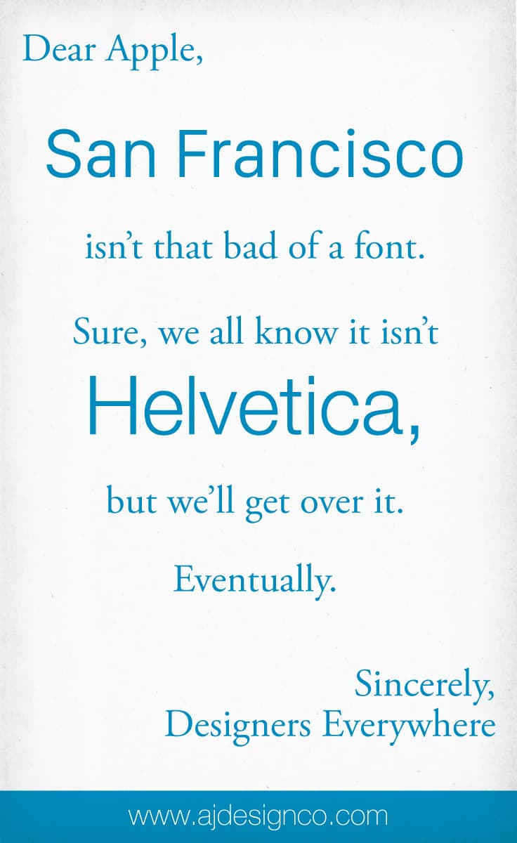
As a cathartic tribute to the typographic fixture that is Helvetica, now conspicuously supplanted by San Francisco on iOS 9, I submit this open letter to Apple.


The name “San Francisco” belonged to an earlier “Ransom Note” typeface. It was included in MacOS until System 7. You think apple could have come up with a better name.
Indeed! Great memory there, Ted. Here’s some evidence for the unconvinced:
https://en.wikipedia.org/wiki/San_Francisco_(1984_typeface)